I confess that I am the sort of person who judges books by their covers. When I walk into a bookstore, I usually spend about ten minutes just browsing the covers of the books that are spread out on the nearest table. I'm not interested in the content, I don't care about the story. All I want at that moment is to look at is the image, the type choices, the paper and printing. Nothing against authors. I just like the look and feel of paper books.
Happily, I've been designing a few books covers myself lately. I have one title still in process for Penguin that I can't show you yet, and another for the small local publisher Red Wheel Weiser on the way. But here are a few covers that I have in printed form — I keep these on a special section of my bookshelf devoted to books I have designed. I did the front, back and spine for each of these, along with tons of feedback and encouragement from art directors.
This is the cover I did for Barnes & Noble's classic books division, timed to coincide with the new Alice film. It's printed with white, black and gold ink on raspberry colored leather. I love the feel of this, but I have some ambivalence about the end product — maybe we did too many revisions.
The nice thing about this project was reading the text in preparation. It's a brilliantly funny memoir about a bad relationship and messy breakup, set here in San Francisco, with much of the action taking place in bars and locales that I know well. But even better was the fact that the author, Linda Robertson, was so happy with the piece that she had my name written into her contract for future books as the cover designer. Can't wait for the next book!
This one I blogged previously, but for the sake of the completeness of this post, I'm including it. Did this for MacMillan, and I have to say that for a kid's book, it's pretty scary.
I've done a series of covers for the yearly collection of stories by San Francisco public school students put out by the fantastic non-profit Streetside Stories. This one is my favorite.
For most of these covers, I did the front cover as well as the spine and the back cover. I really think those elements are integral to the whole, and I'd rather do that work than have another designer put their gloss on my work. This one is for the local anarchist publisher, AK Press. I own so many of their books, so it's nice that at least one of them has my work on the cover.
Last but not least is the cover I did for my friend and frequent collaborator on political projects, Chris Carlsson. This book, which you can download for free or buy here, is a novel in the utopian tradition set here in San Francisco. My favorite thing about the book is that, while you're reading it, you begin to see little hints of the utopia Chris is describing that seem to exist right now, in our current city. Which seems to be part of the point. If we can get a few things right, why not the whole enchilada? Why not dream big?
I'll post the new two new cover projects as soon as I have the actual books in hand!
One of the reason I love doing posters and book covers is to have the opportunity to do something fun with type. Each letter has its own character, its own essence, and it's fun to try to craft something new that still captures the essence of the letter. But just as important as the letter forms is the shape of the word, and how that shape and style relates to the meaning the word or name represents.
What started me thinking about doing a blog post on my type work was a job I got recently doing just the type for an ad. The assignment was to make the words look like a bunch of spilled water being soaked up by this sponge. It took a lot of back and forth with the art directors, but I'm really happy with how it turned out.
Of course, I'm usually doing type for posters. Sometimes, I start with an existing typeface, and I'll embellish and distort it as I see fit. That's how I did this type for the poster I did for the Pixies: I started with the word set in a circus font called Captain Howdy (a dorky name, I know, but what do you expect from a circus font?), and I just re-drew it and embellished it till it looked right.
But more often I draw the type freehand. I have a few different "modes" of doing type. One is a sort of spooky serifed typeface, where I use the serifs (the horizontal caps you have in a face like Times or Garamond) almost as decorative elements that taper and spindle off in different directions. (It should be clear how much of a debt I owe to the type designs of the filmmaker Tim Burton, who must be the most multi-talented man on the planet.)
Here's another in this halloween-ish style, which was part of a poster I did for Rupa and the April Fishes (this is the type for the opening band):
I also have a loopier, more fluid type design that I like to do, that is less spooky and halloweenish. Here's what I did for the Stern Grove festival -- this type appeared on the poster and was also separated out for banners and signs and things at the event.
I used this style of type for the cover of the 7x7 magazine that I did last June:
And for the logo for the fantastic band the Sippy Cups, a children's psychedelic rock band that I do a lot of art for. (If you go to their site, check out the nice way they "flashified" the logo in the corner of their splash page!)
I've got more type projects coming up, so I'll post those when they're ready!
It's been so long since I've blogged anything new that I now have a backlog of items I haven't posted. So I'll start with the most recent, which is the piece I did for the California State Lottery's Free Music series:
So often I don't ever get to see my illustration work out doing it's job in public. But the other day, on my way down 24th Street in the Mission, I came across the lottery posters plastered all over the place:
I've had posters of my work wheatpasted around town before, but it's usually political posters that we've put up illegally. Kind of strange to see my work posted legally and in full compliance with all laws and permits!
I'm really happy with the result, and the decision by designer Rachel Vale to reverse the image on the back, making the spine of the book the trunk of the tree. It's really satisfying to work with talented art directors!
The image is simple, but as with so many of these types of images, there is a lot of work that goes on behind the scenes. Here are just a few of the many color sketches I produced for this job -- as you can see, we tried a bunch of different approaches before settling on the girl in the tree.
Also in June, I did the cover for San Francisco's 7x7 Magazine. I love getting a call to do a magazine cover, but when it's your own city, and the issue is the Best of the City issue -- well, that's just extra flattering. Here's what some of the earlier versions looked like:
One thing that was a treat for me was that the art director chose to print this using Pantone colors rather than CMYK, so I got to choose two Pantones I love, and we ran the turquoise at different screens to get different shades. If you can find a printed copy of the magazine, you can see what difference to the color it makes!
I'll be posting more regularly in coming weeks and months!
My friend Tristan Anderson has been critically wounded at a protest in the West Bank. I don't know all the details, but apparently the injury is from a teargas projectile fired by Israeli soldiers. The injury is very serious, and Tristan is going to need help from his community in the coming months.
To help raise money for Tristan's recovery, I've put together 20 complete sets of the 6 posters I have done for the Bay Area Anarchist Bookfair over the years. Posters are all offset litho, all 11x17 except for the 2004 poster which is 12x18, all are mint condition and signed by the artist.
Your $100 will go directly to a fund for Tristan. I don't have information on the name of the fund at the moment, but I will post that just as soon as I have it.
My thoughts go out to Tristan and his family. He is one of the most positive, engaged and energetic activists I know, and I hope he can make a speedy recovery.
Mati and I have an art show open now through the 28th in Albuquerque. Turns out Albuquerque is a lot farther away than I thought. It took us three days of driving to get there (we drive slow.) We spent the days between Christmas and New Years hanging the show and painting a full size mural in the gallery of the Harwood Art Center.
The show is called The Monster Under the Bed, which seemed an appropriate title for the dreamy and nightmarish imagery in both of our work. Nick and Amy of the Church Animals came out to play for us on opening night. Here are some pics!
And here's a video we produced of the mural we painted on the back wall of the gallery, featuring music by the amazing Church Animals. Hope you like it!
The show is up until January 28th, and the a version will be coming to San Francisco in February -- opening Feb 13 at aMuse Gallery, details to come!
We've settled in to a semi-regular existence in Florence, with a rented apartment in Oltrarno, the so-called "working class" district that reminds us a lot of the Mission back home. The crowds and the tourist attractions are several blocks away, across the river Arno, so we have all these tiny cobble-stoned streets and cheap wine bars to ourselves. It's a pretty sweet life!
This sort of travel suits us better than moving from town to town every day. We can save money on living quarters, and cook at home every once in a while. Still, the truth of the matter is that the moment you stop moving, time speeds back up. It's easy to lose a day as the rhythms of everyday life take over. That's pretty much what happened to us today.
Our plan had been to enjoy a leisurely morning (as usual) and hop on a train at noon to visit our new friend Shanna's place in Pontadera. We met Shanna here in Italy, but she is a former San Franciscan that we met through good friends Kim & Jason and Megan. A few days back we stayed with her, and when she mentioned that the olive harvest was coming up, we jumped at the chance to return. If you conjure up your vision of the fantasy Italian countryside home -- maybe an old farmhouse in the countryside converted by loving hands into a perfect Italian villa -- that's pretty much where Shanna lives. Her family owns the place and has been fixing it up for decades now. Shanna lives there with her husband and adorable 15-month old daughter. A pretty idyllic existence!
Well, getting back there seemed easy enough. The train leaves every few minutes, and takes about an hour. We hopped in a cab, and thought we were on our way. But when we arrived, we learned the Italian word for "strike": Sciopero. No trains for Pisa today.
Still, this didn't stop us from foolishly buying a ticket in the hopes that somehow it would work.
Staying in Florence wouldn't be that bad. We've been trying to make it to the legendary Fra Angelico frescos that grace the former living quarters of Florentine monks at the Church of San Marco. So we hopped in another cab (for another 8 euros), and arrived at San Marco only to find that the church is closed on the 2nd Monday of every month.
Well, by this time we were ready to head back to our lovely Oltrarno district to drop off our bags. Having just wasted 20 Euros on cab fair and 12 Euros on a useless train ticket, we thought we'd walk. Ever tried to walk down narrow, cobblestoned sidewalks with a rolling suitcase? It's no fun. We grabbed a third cab home for another 8 Euros.
What do you do when your travel plans fall through? Laundry. As it happens, there is a laundromat just down the street from our home. Naturally, we forgot about the Italian habit of closing for lunch from 1-3, so we had to sit an hour in a cafe. And now we are in the laundromat, watching our clothes go around and around. We need a break! I think we'll take ourselves out for a nice dinner in the Santa Croce neighborhood we've been meaning to visit, using recommendations from Kate & Sean. We'll get a botiglia di vino, do both a primo and secondo piatti, and stop by a gelateria on the way home. That'll be the end to a nice day.
Cab fare = 26 Euros Cafe = 4 Euros Laundry = 9.50 Euros Wasted Train ticket= 12 Euros An ordinary day in this beautiful city = Priceless
The Mission Cultural Center asked me to paint a mural-sized political cartoon during the opening of a show they produced of experimental drawings and political cartoons. I was sort of nervous about the prospect of painting in front of a large group of people, but I decided it was worth doing, just to say I did it.
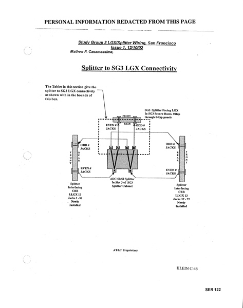
I chose as my subject the "secret room" at AT&T's Folsom Street facility. Here's the time-lapse video my awesome co-workers, Chris Contolini and Richard Esguerra, shot and edited:
While I was painting, a visitor asked me if the story of the secret room was real. "Like, is this legit? I mean, for real?" he asked.
It does sound fantastical, but sadly, the story is true -- except that no one knows if the secret room is inhabited by a giant, data-guzzling baby because only the NSA has the keys to that room.
What we do know is that the Bush administration asked AT&T to install a fiber-optic splitter -- a big version of the device you would use to make a copy of your cable signal so you can watch cable on more than one television -- and use that splitter to make a duplicate copy of most of the Internet stream passing through the Folsom Street facility.
How do we know this, you might ask. Well, I'll tell you. A technician named Mark Klein learned about this spying setup when he worked for AT&T in the Folsom Street facility. It took him some time before he understood exactly what was going on, but once he did, he was horrified. He kept his mouth shut, but secretly collected documents to prove what he knew, and when he retired, he took those documents home with him. He shopped these documents around to journalists and privacy advocates, but he got nowhere until he walked into the EFF offices one day in 2005. EFF was already working on a case against AT&T, so Klein's documents provoked a lot of interest. (Here's a good video of Klein explaining what he saw on Keith Olberman.)
EFF hired an independent expert to examine the documents, and the expert -- a guy named Brian Reid -- verified their authenticity and made a statement saying that they showed exactly what Klein was claiming: a massive datamining program sweeping up the communications of millions of innocent people. For its part, AT&T angrily insisted that EFF return the documents, claiming they were private property -- nice move, since this also provided verification of the authenticity of the documents.
So what this means is that copies of the communications and internet data of millions of people have been, and continue to be, intercepted and delivered to the government. For the lawyers at EFF, it doesn't really matter what they're doing with all that data once they have it in their secret room. What matters is the simple fact of interception on a massive scale, which violates several major privacy laws -- including the 4th amendment to the Constitution. But for an artist like myself, it's the secret room that holds the key! For me, it's impossible not to try to imagine what goes on inside that room.
Sometimes, when I've told people about this, they express disbelief. It's hard to believe something like this could be happening, and that it isn't covered by the mainstream media. But in fact it is covered. The New York Times, the LA Times, the Wall Street Journal, the Washington Post, have all covered this story and confirmed the broad outlines of the story -- and in some cases, these papers have uncovered new information. But as it turns out, getting a story onto the front page of the New York Times is not enough to make a scandal.
I'm reminded of the stack of newspapers from the Watergate era I once saw for sale at a garage sale in Berkeley. As I looked through them, I realized that the thing that made Watergate so big was the fact that it was on the front page every day for weeks and months on end. We haven't had any coverage of the Bush spying scandals that even comes close to the saturation of the Watergate stories. Sort of ironic, considering the difference in scale: Wiretapping a few politicians, vs. wiretapping the entire public over the course of 6 or 7 years!
I like pointing this out, because I think it's interesting that this is how secrets are kept in the modern world. They aren't exactly suppressed, in the sense that journalists still cover the story, and groups like EFF still file lawsuits, and no one is sent to the gulag. But the story doesn't ever quite get out. The secret is there, out in public, but nevertheless hidden. You could say that stories like the Mark Klein's story about the secret room are public secrets.
So, anyway... That's why I chose to this subject for my cartoon. I hope it intrigues a few people to dig deeper and find out what's going on. And for those that already know about the NSA's illegal spying program, I hope it helps add a little bit of mythology to the story. Maybe that's what it needs -- some mystery! A secret room to inflame the imagination...
The show is up through September 14th, with work by several fantastic artists, including cartoonist Spain and my talented friend Paz de la Calzada. Go check it out!
PS: Speaking of Public Secrets, my acquaintance Ken Knabb tells me that his website, the Bureau of Public Secrets, has just entered its 10th year. Ken's site is a great repository of Situationist texts, but Ken has also filled the site with his own great writings on politics and Buddhism, as well as the collected works of Kenneth Rexroth. Great work, Ken!
Hugh is living under the spell of a delusion. He believes that what he does in the world matters, that there is some meaning to his life. He knows that the planet he lives on is a tiny spec of dust in a universe too vast to even imagine, and he knows that he scurries about with as much significance as a termite on a log. Nevertheless, Hugh is certain that life is good, and that the future is full of promise.


